 I didn't have an in progress picture.
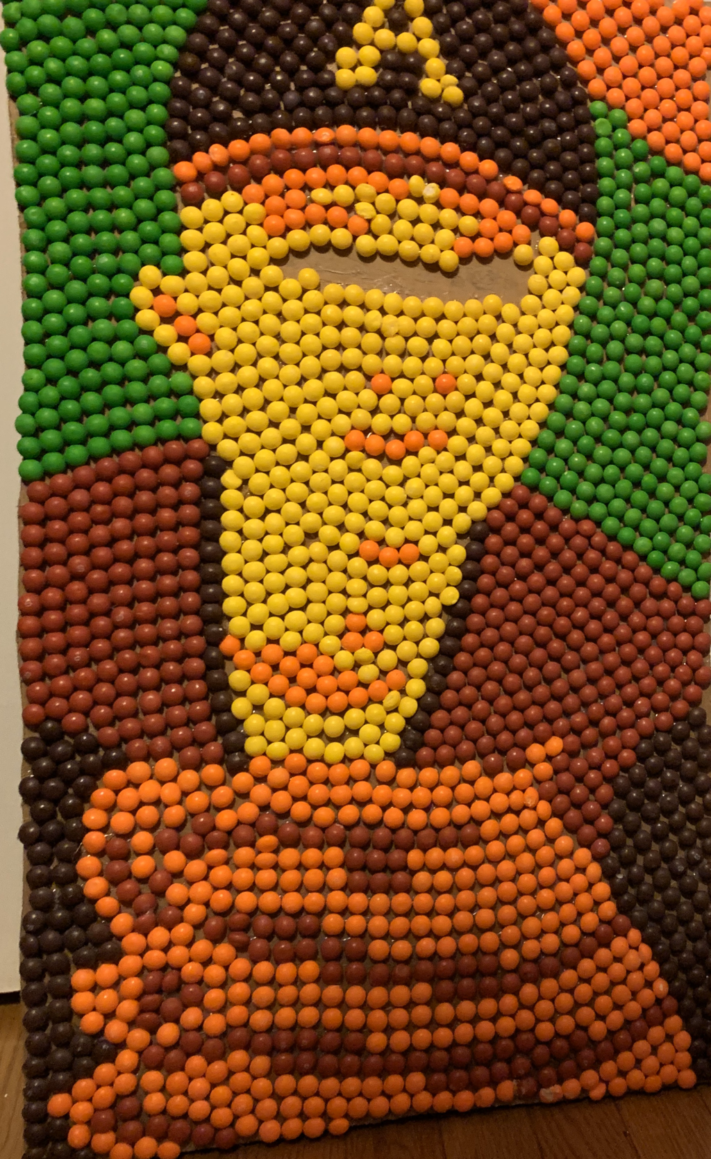
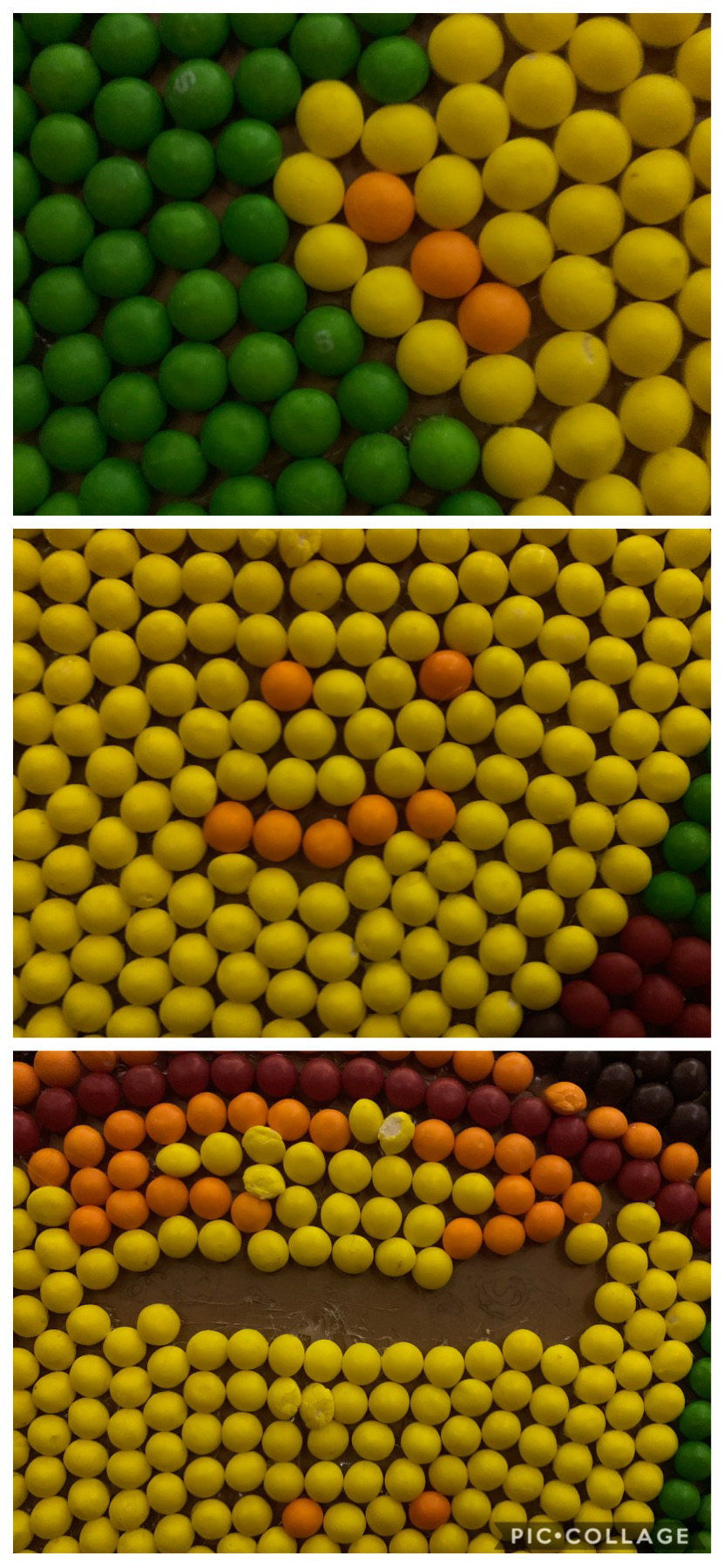
I did the portrait of my brother, Bryce. I used skittles and a lot of hot glue. I started off by changing the picture to only show the lights and darks, then I projected it up onto a large piece of cardboard, traced the picture, then decided which parts were going to be which colors. Then I began gluing all the skittles down. I found it successful that you can tell its a person, but I also found it hard to fit some skittles in certain places without leaving too big of a gap but also not squishing them. If I could do this project over I would not use skittles, it was very time consuming and I used A LOT of skittles which I bought on my own.
0 Comments
 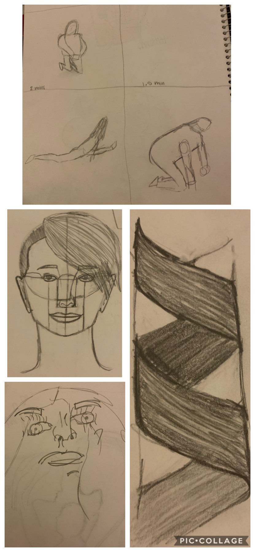 First picture: top-ear middle-nose and mouth bottom-eyes(not finished) Warm-ups: top-gesture drawings right-hair left-proportions bottom left-blind contour skeleton drawing- threw away before picture taken The most helpful warm up was the face proportions. It helped give me an idea of where the face should be and helped me a lot when tracing it out on cardboard.
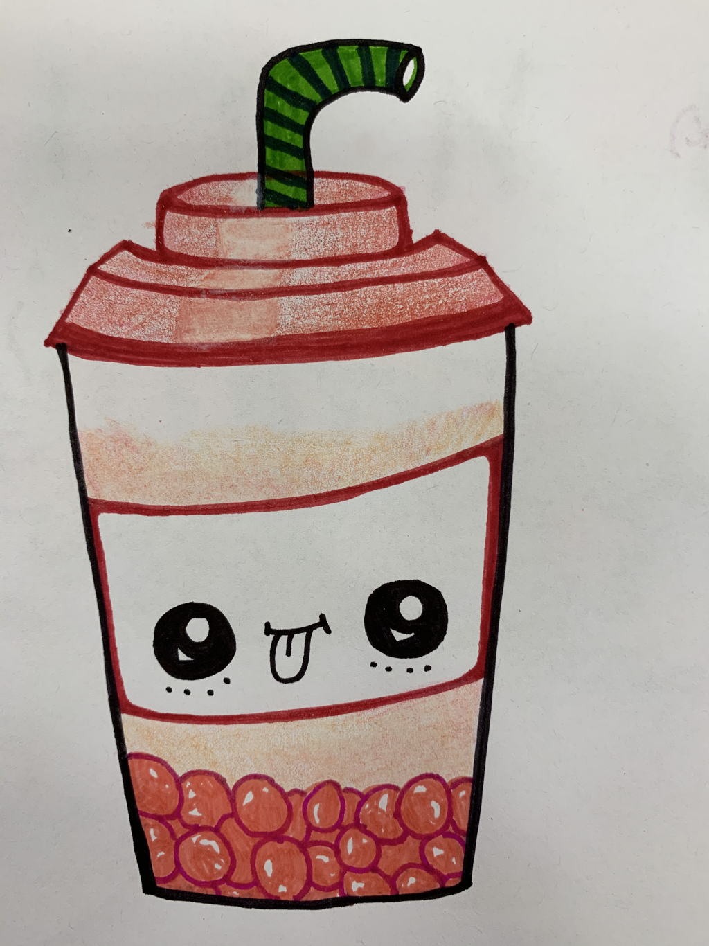
I was most surprised about how long the ear was, I did not expect it to go from the middle of the eye to the top of the lip. But when you're finished it looks normal. Question 1: A. Describe the artwork. Explain what you see, what elements are in the artwork, describe how you would over the phone. B. Analyze the artwork. List the art elements and design principles, for example, color, value, line, texture, space, etc. C. Interpret the artwork. What is the mood, what story is being told, what ideas are being represented. D. Judge the artwork. What is your opinion on the artwork, was it successful/unsuccessful, why or why not. Question 2: Critique, avocado(final project) A. There's a half cut avocado with the pit still inside made out of watercolor paint. It is perfectly green with a yellow touch towards the center. The background is a mix with blues and purples striped across the page but not completely covering the page. B. There are mainly light colors being used. The greens are blended in very well with the yellow around the pit. The texture of the pit looks very realistic with the highlight. C. The mood is very light and happy. I used light colors to create a bright mood. There's not really a story behind it except that it's after a vine of a woman saying, "fr-e-sh-a-voca-do" D. I think the art is successful, it was exactly what i pictured in my head. I wish I could've added more realistic detail to the avocado if I had more time. Question 3: #6 Some artists create art to express their feelings or emotions. They use different techniques to explain themselves when words aren't able to, many do this rather than using words just like some artists use music to express themselves. Other artists may do it because they simply enjoy the peaceful time to let their imagination take over and create masterpieces. Each artists has a different meaning behind their art and their reasoning of why they make art. Question 4: #24 My least favorite material to work with was acrylic paint. I didn't like how fast/easily the paint dried. Yes you can paint over it but if you have to paint over a darker color it is harder to cover it up. The paint wouldn't spread very far so you have to use a lot and I didn't like that. It was also very difficult for me to mix the colors to get a certain shade I wanted. Question 5: #26 My favorite material was watercolor paint. It was very easy for me to get specific shades of colors. I like a very little of the paint goes a long way. I also liked how if you made a mistake you could basically erase with water. The only think I didn't enjoy with watercolor was the paper easily rubbed away. 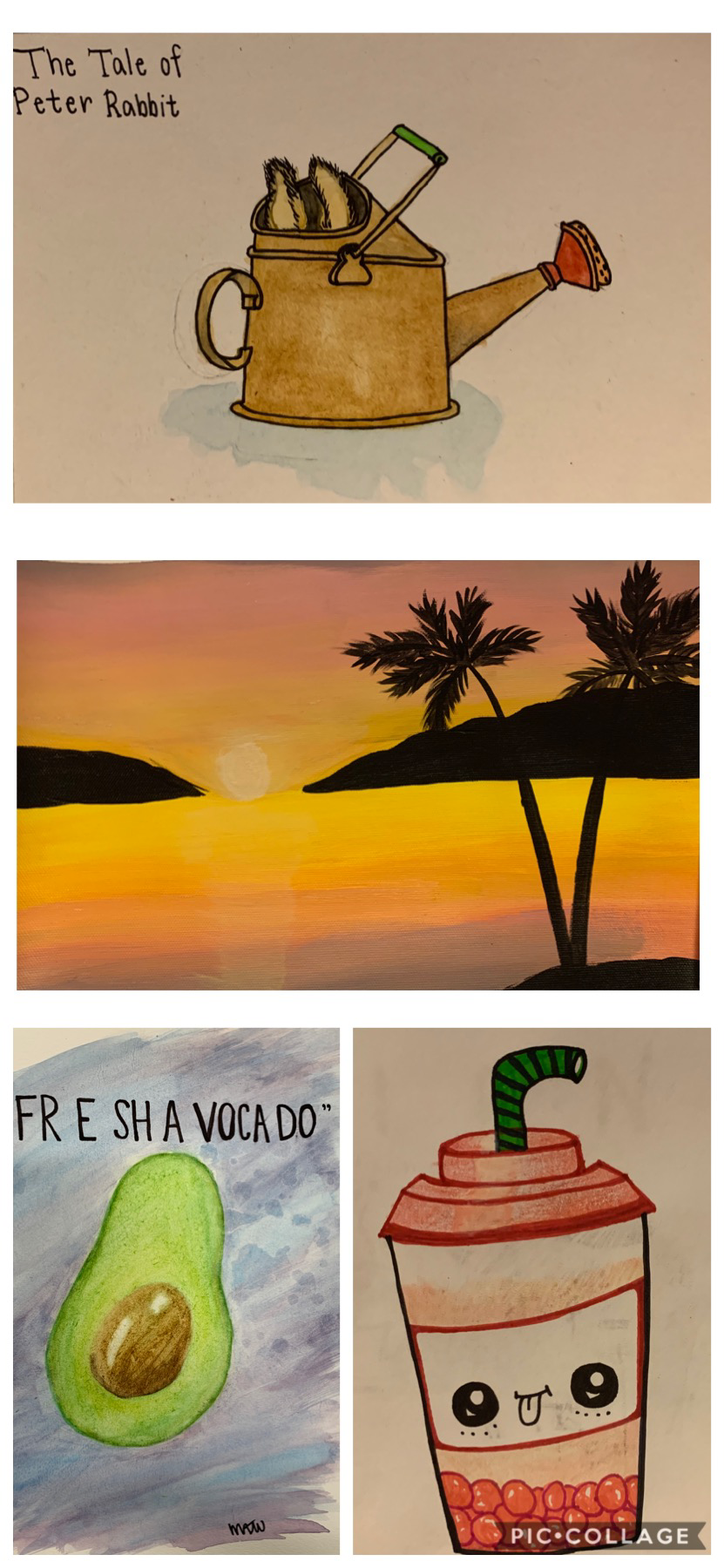 Top- watercolor warmup
Second- acrylic painting Bottom left- watercolor final project Bottom right- illustration Friday(expressing feelings) 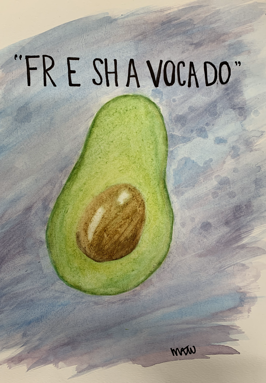 Pros- It turned out just like the image I was going off of and I ended up liking the background when it was just a mix of blues and purples.
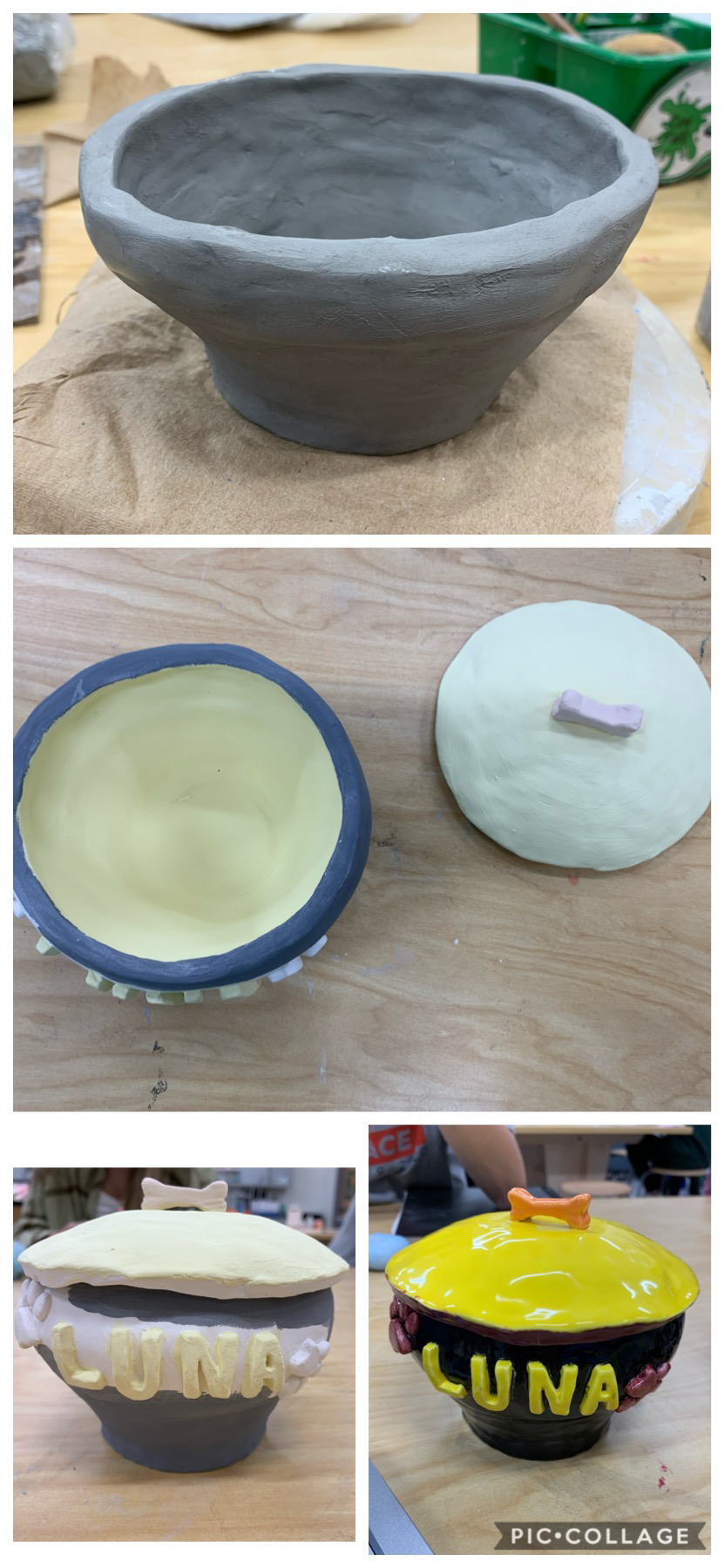
Cons- I didn't get to add as much detail as I wanted to since I spent so much time on my portrait project. Process- I just used water color paint and blended light and dark shades of each color. 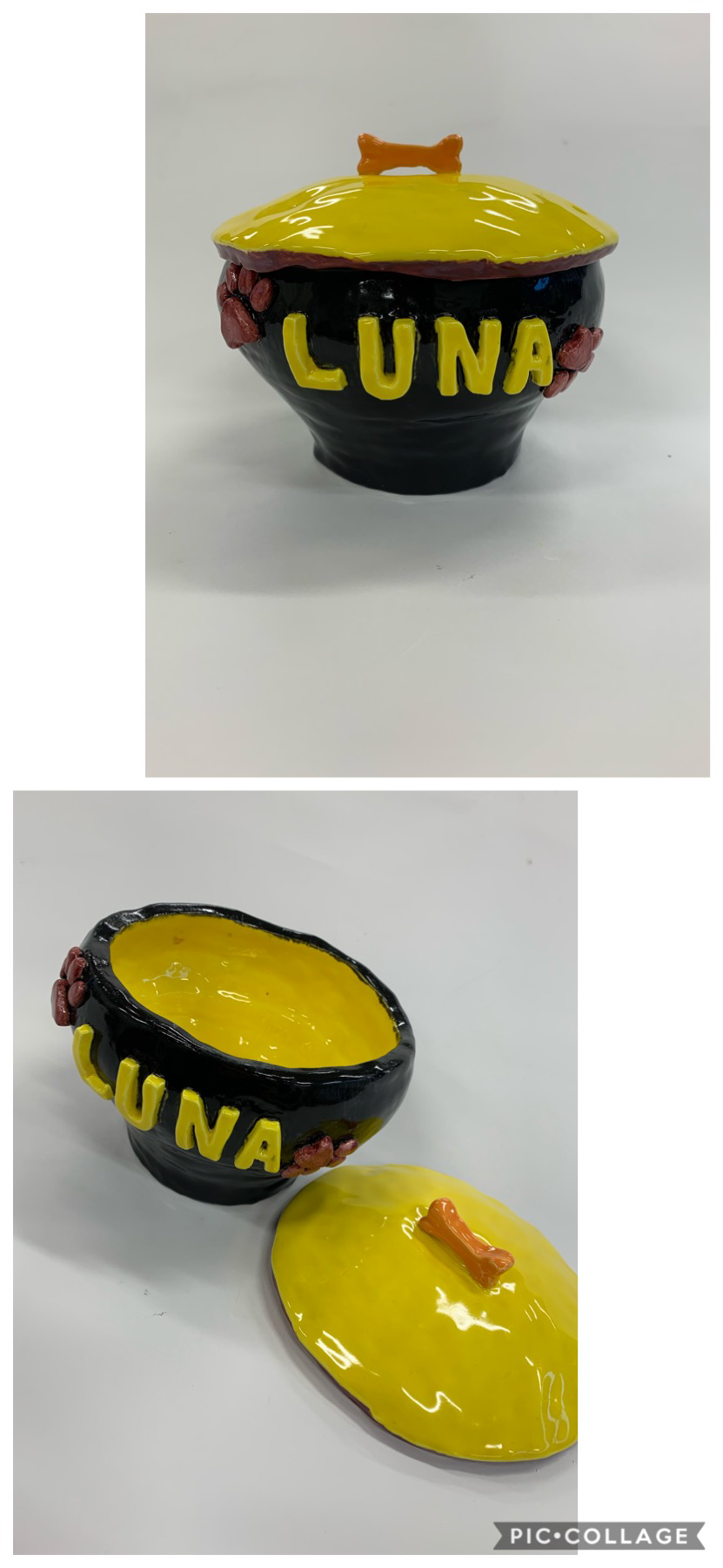 (I have the in process pictures in another blog post) My tray set is used to hold dog treats. I made it deep and a little wide so it could hold a lot of tiny treats. I came up with the idea because it was around Christmas and I needed a present for my sister, she just got a puppy, Luna, and a house with her boyfriend so I thought it would look nice with something I made. I used the technique 'coil' to make it. I used the needle tool, scoring scraper, and the rib often. I would use the needle tool to have a clean cut on the clay, scoring scraper to score, and the rib to smoothe it all out.
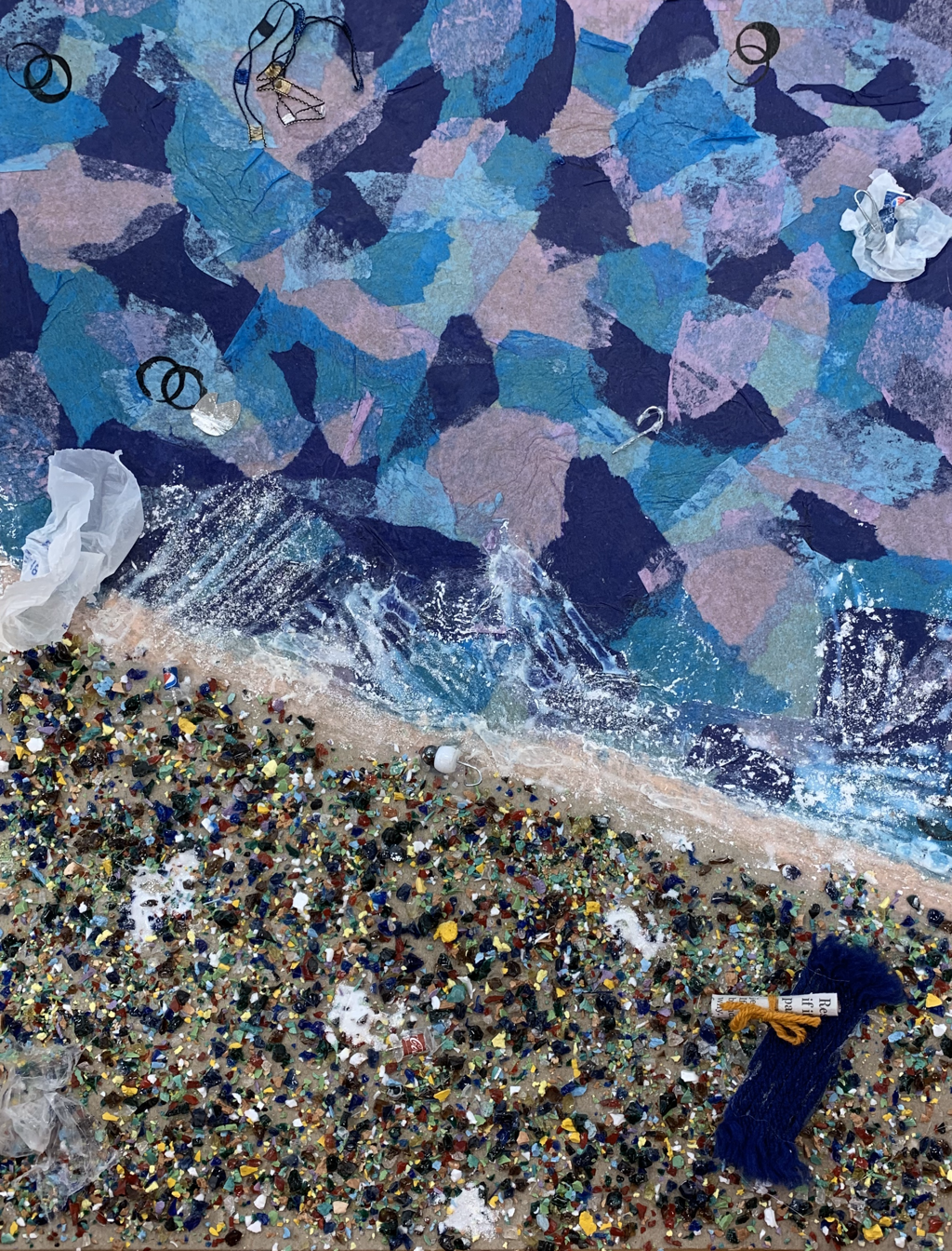  I used glass, tissue paper, cardboard, plastic bag, white chalk, tac, metal, thread, newspaper, ink, and string. I used the glass to represent the "sand" on a beach. The tissue paper was used for "water". The cardboard was the base/poster that I put everything on. I ripped pieces of plastic bag to make "smaller plastic bags" in the ocean and on land. The white chalk was used to be the "bubbles/foam" on the shore which is actually not safe. I used a tac to make a "mini soda bottle" and put a mini label on them. I used the metal to make "fish hooks" to show that fishing equipment is just left in the ocean/beach. The thread was used for a "towel" and the newspaper was a "mini newspaper" to complete the look of a beach. I also used ink in the water for "oil bubbles" since there have been oil spills in the past. Lastly I used string in the top left to make a "fishing net" again to prove fishing equipment is just left in the ocean. My theme was publing, my quote was "think about something in your everyday life that you take for granted" I wanted to show both so I used a public beach that many people just leave their trash without realizing they're polluting sea life habitat.
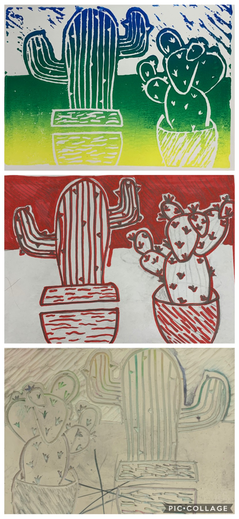 My piece shows the theme of line by only cutting out lines, I never shaved out chunks of it only lines. I also only used lines to decorate the pots of the cacti and the background. My piece was successful because it has fine lines that make it easy to see. I was happy I was able to fit both cacti on the block without having to make it smaller or mess up. If I could go back I would make the top background less deep so the paint showed up on more of the lines and made the cacti pop. (I couldn't find a sketch)
|