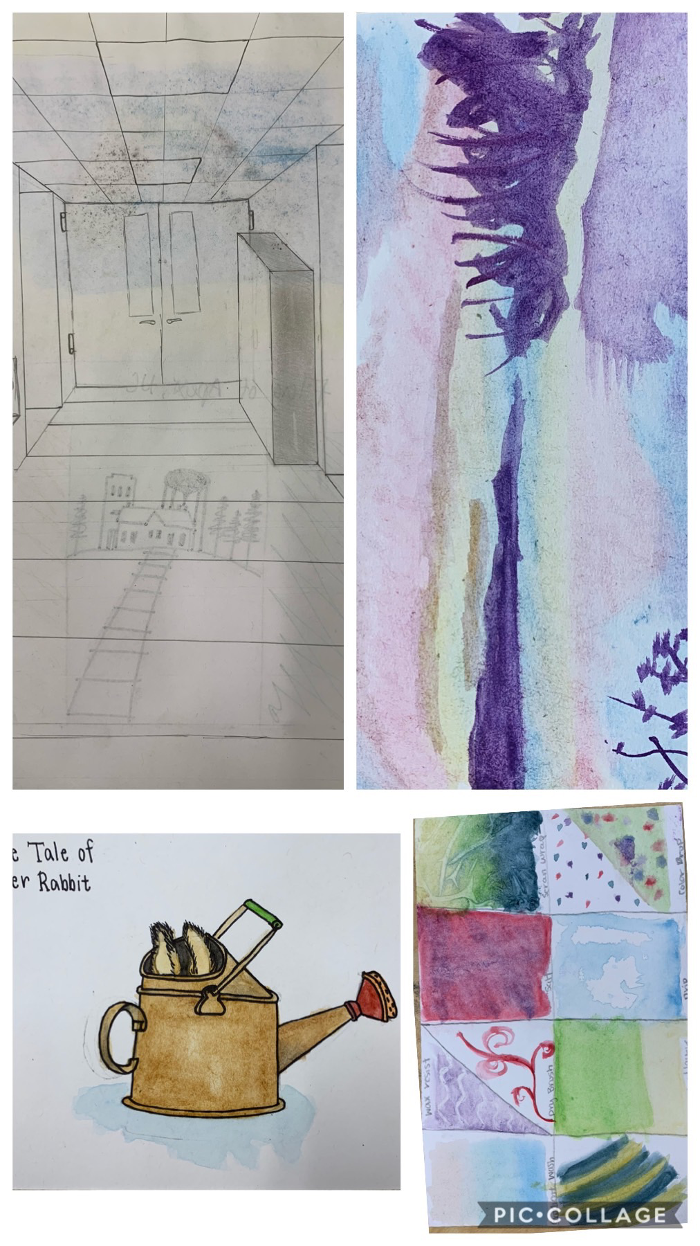
 I found the hallway the most helpful because it helped me understand perspective much better. I like that if you mess up you can easily add water and it makes it almost completely go away. I found it hard to make the same color multiple times when I would run out of the color.
0 Comments
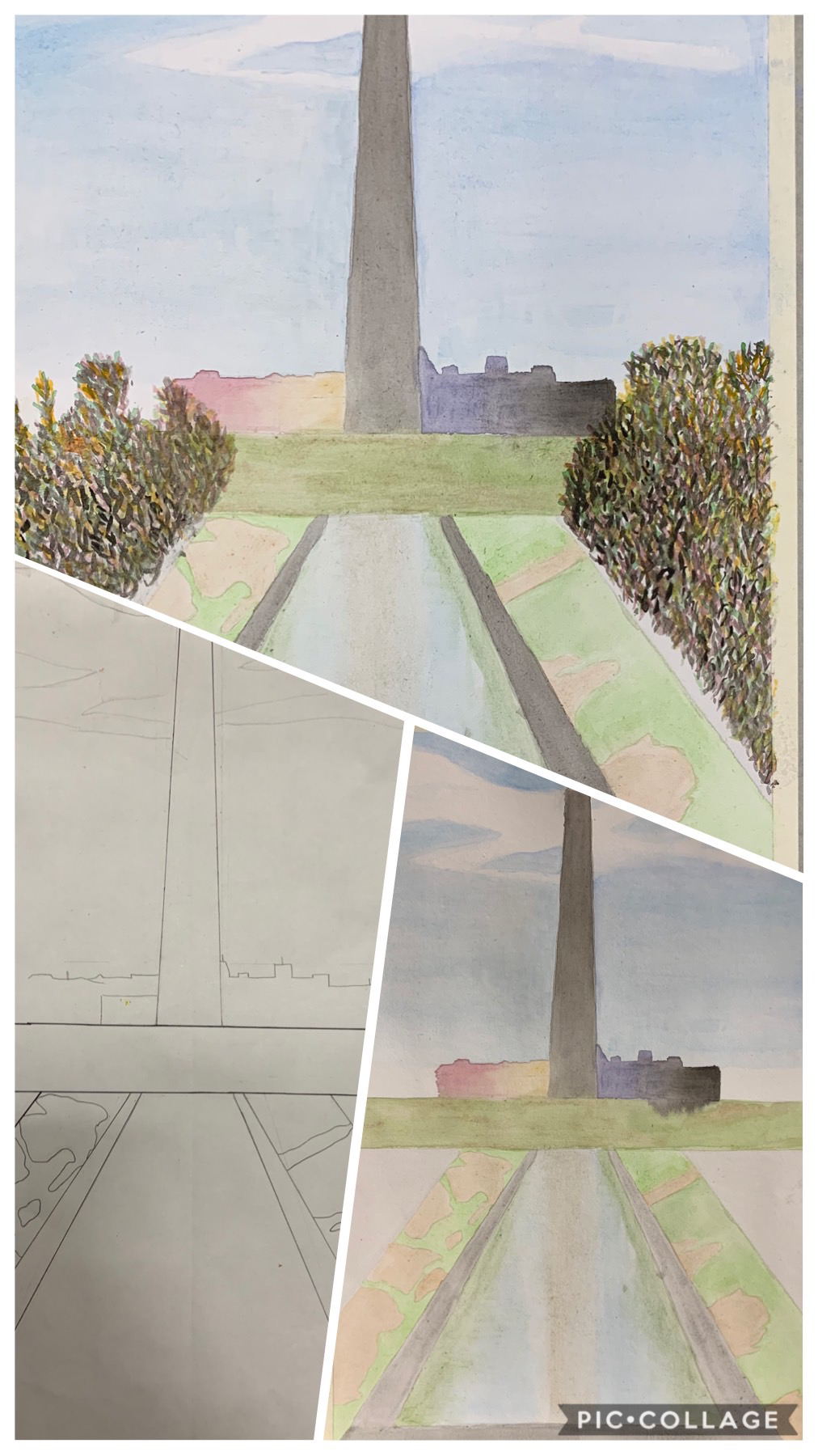
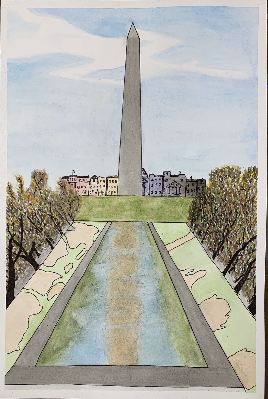 I took this picture last year on a field trip to Washington, D.C. of the washington memorial. I found the water and tree reflection very difficult. The two warm-ups I chose, hallway sketch and watercolor techniques page very useful because the sketch helped me understand that everything meets to one point and that really helped make it look better. The watercolor techniques really helped too because this taught me different ways to use the paint to get different looks and textures. My painting is a one point perspective because it all goes back to one point of the picture.
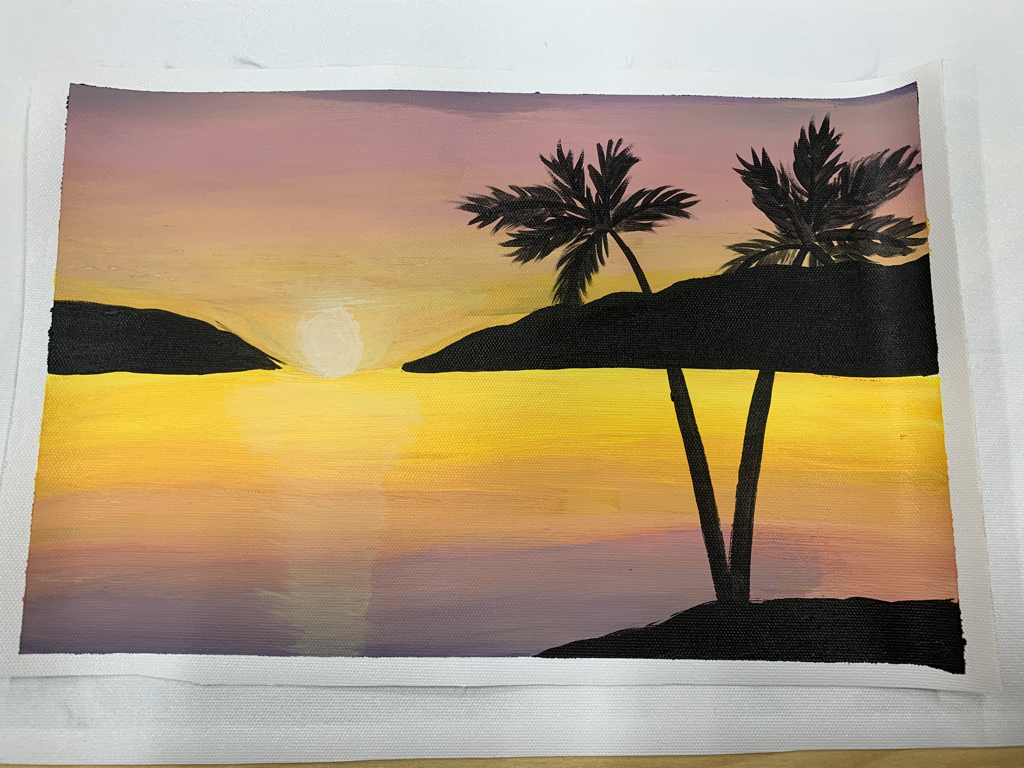 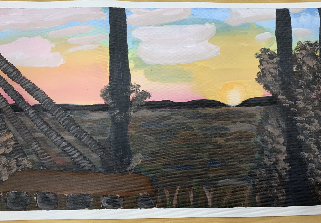 I ended up doing two acrylic paintings. The most helpful warm-up was the Hue Value Scale because it taught me how to use other colors to make a certain shade of color. I did not get any process pictures, only the finished paintings. The bottom painting was my original "idea of place" which is a painting of my friends' lake house, I go up to the lake house with her and her family a lot during the summer and get to experience the most beautiful sunsets every time. I found the water very difficult to do and not being able to get the same color throughout the lake water. I think the sunset glare or the trees/bushes were the most successful of my piece. I had a hard time capturing the right colors and it ended up being a lot darker than wanted.
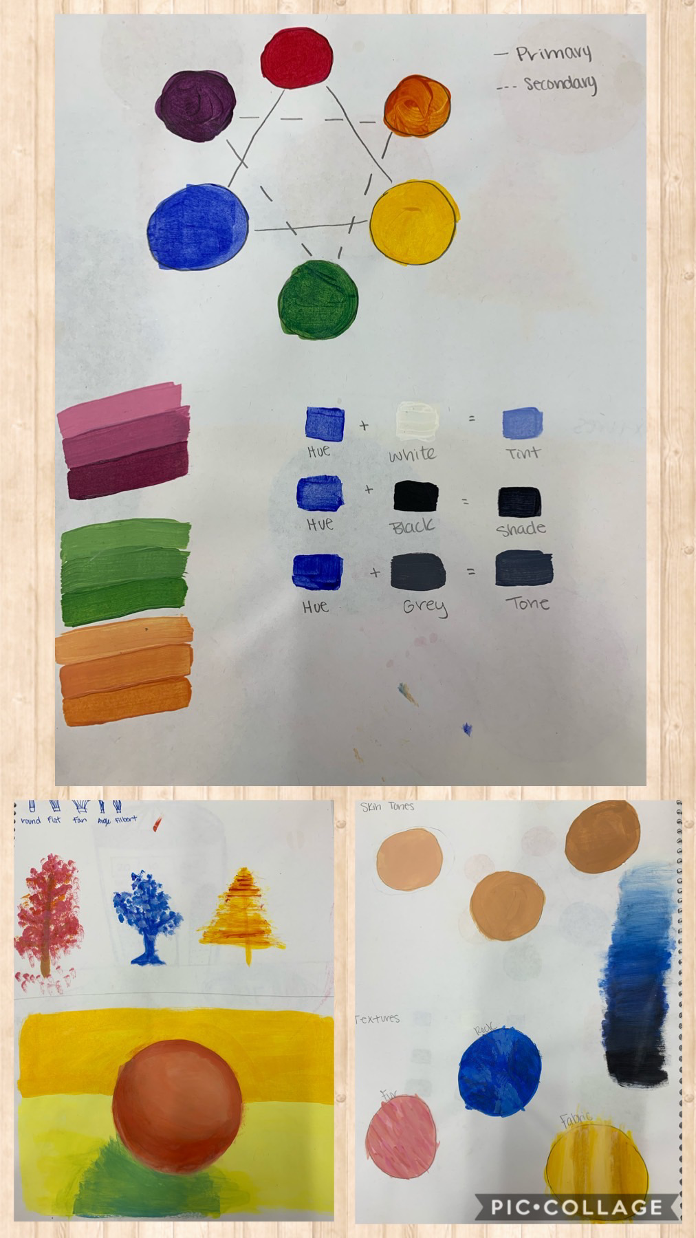 1. I learned how to specifically work with acrylic paint, like how to mix, how to blend, how to make different colors, etc.
2. I think the 'color wheel' will really help me so I will be better at matching colors to the original picture. 3. I felt like the 'gradient of color' warmup really helped prepare me for blending. I used it many times in my painting, for the sky and water. 4. To make brown you can mix a primary color with its complementary color. Ex: Red & Green 5. To tone down a color you can add a lighter version or paint color like white. 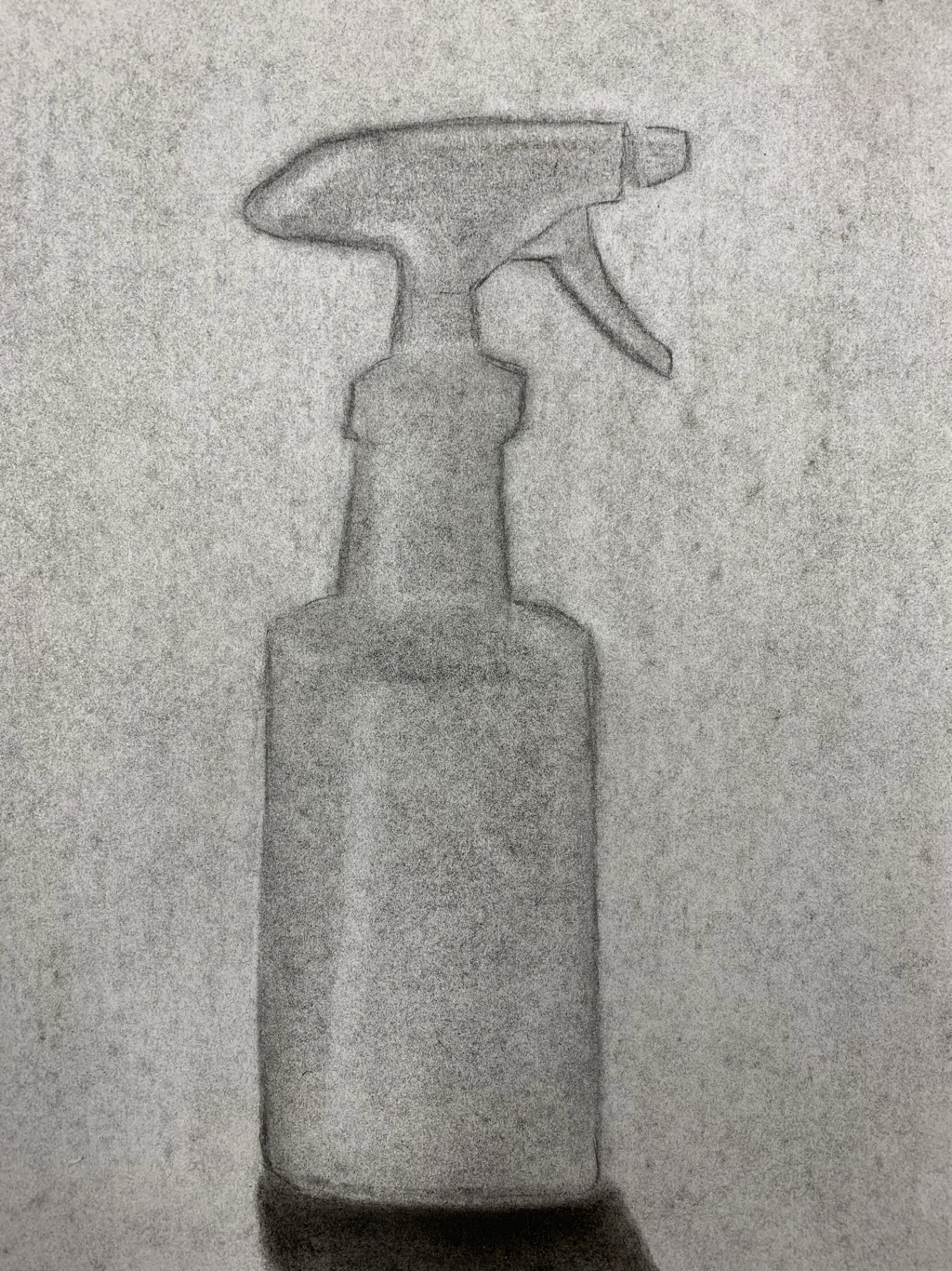 The most helpful warm up was the value and scales because it helped me understand how to mix to make certain values. Composition- the way in which a whole or mixture is made up. Value- the visible lightness or darkness of a color.
Pencil- Pros: easy to erase if you mess up Cons: It was harder for me to add detail because it's so thin Charcoal- Pros: easy to add shadow and highlighter Cons: It would smear everywhere Pen- Pros: could use different techniques in the same drawing Cons: took a long time |